


Perhaps color is an age thing.
Or maybe appreciation of color is an age thing? or could it be desire of color?
I don’t know.
I find that, more and more, I like color. LOTS of color. I like more color. I like color combinations, and more color combinations. I like color contrasts.
And I don’t rightly care all that much if the colors I like are “in” or not. Fashion color trends don’t seem to dictate my choices of – or desire for – color.
Is it an age thing? Or have I just become more open-minded?
I will chalk it up to the latter, and I will chalk it up to the latter for all those people out there who are accused of garish color choices “because they’re old.” I do not think it is age. I think it is the understanding and acceptance of the fact that Life Should Be Colorful. Color begets joy, darn it.
I got to thinking about this in depth for two reasons: 1. color plays a Huge Part in embroidery life;
And 2. Well…
There’s the Matter of The Blue Shelf.

Just wait a sec! Don’t write me off!
The studio is not really a super-colorful place, you see. It’s mostly white. The walls are white, most of the furniture is white, the cabinets are white, the window blinds are white. The floor is some indiscriminate old laminate that’s supposed to look like wood and is passable under the circumstances, and some of the furniture (my Uplift tables and our tea station) have light wood tops.
But overall, the impression of the place is white – on purpose, because I like bright, sunny, and … bright.
But then, one day, I was perusing Facebook Marketplace looking for an organizational shelf for my garage at home, where I could store my beeswax stuff. (I make these beeswax petites for the shop in my garage at home. It’s not really a garage. It used to be the original Needle ‘n Thread studio. You can read about it here).
And low, I came upon a rather blue-blue, very blue shelf.
I am not sure why it called my name, but lordy, how it did! To the point that I drove almost two hours in one direction to fetch it.
It doesn’t even fit in my garage. And it’s not an organizational shelf.
In the scheme of things, it’s not all that well refinished, either. The background is contact paper (I’m going to re-do it with the same contact paper, but a little more neatly), and the whole thing is painted this inordinately bright cobalt blue.
But wow. I saw it, and I thought, “I must put that in the studio.”
(Anna was skeptical.)
But I did it. I went and got it.
And I put it in the studio.
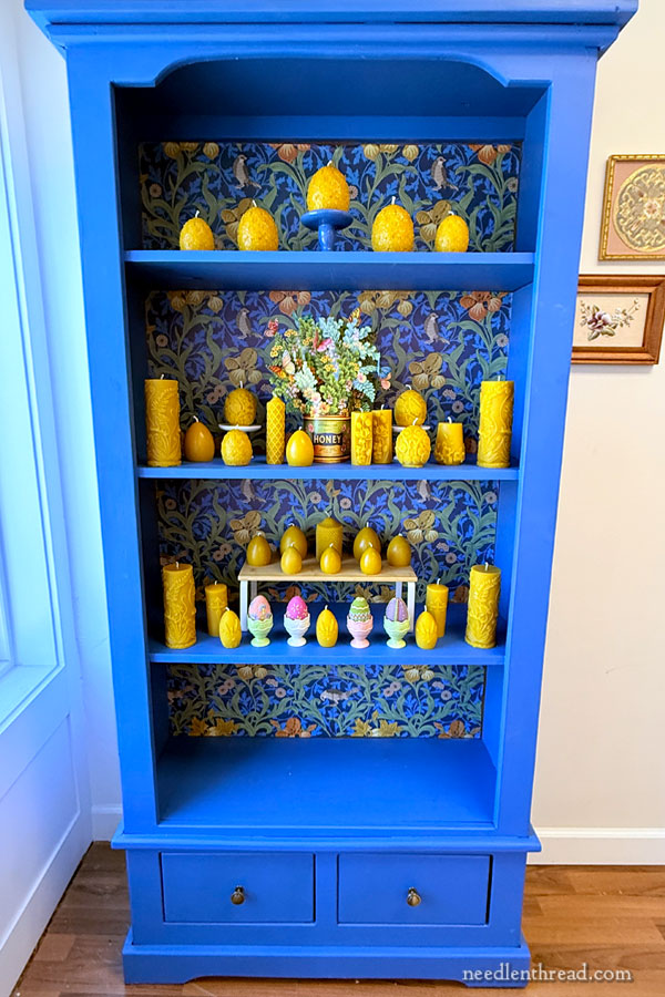
Onto it, I put my latest batch of beeswax candles that I pour while making beeswax petites for the shop.
Right now, they’re pretty much all Easter / Spring themed.
I knew, in my heart of hearts, that the candles would look great on that shelf!
It’s true that the shelf lets off a definite blue glow in that corner of the room when the sun is shining. It might be a bit much, but I can’t help it. I still love it!
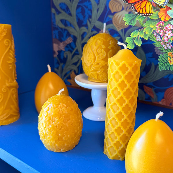
I use cap wax to make the beeswax petites and to make candles. It’s a glorious wax – deep gold – with an almost-heady, rich honey fragrance.
How could it not look good against this blue?!

Sometimes, I talk through these things in my head, mostly to convince myself.
It could actually be slightly garish.
(But don’t tell Anna I said that.)
And we did have to shim up the right side of the shelf, because it sits kind of crooked. It’s the floor – we are in a 150+ year old building in Kansas. That’s just what happens to floors. Anything we put along that wall tilts north.
And it is also true that the paint job and the papering job were not very well done.
But you know, I would never have thought to refinish a shelf this way, with these colors and that background paper. I don’t know that I would have had the courage to be this bold in my color choices.
But wow! When I saw the shelf, I just knew I wanted that splash of color in the studio.
And I succumbed.
Have my color preferences become garish? I don’t really know. And I don’t really care. That blue shelf makes me happy.
I think it’s important to keep this in mind as we contemplate projects – whether needlework or otherwise. Choose colors you like that make you happy. Otherwise what’s the point of these wonderful gifts of vision and sunlight that we enjoy? I say appreciate them and make the most of them!

And what better time to do that, than Spring?
This is my favorite tree in my backyard. It is abundant with blossoms right now – and covered with bees!
Happy Spring, my friends!
Leave A Comment