Many moons ago, after compiling and publishing my e-book Favorite Monograms – a collection of 16 monogram alphabets for embroidery – a reader wrote in with a specific embroidery project in mind, using initials from the book.
She wanted to combine two initials into one monogram and work the initials in real gold threads, and she needed some suggestions on how to go about the whole thing.
Today, I want to share with you the results of our correspondence, the methods behind the project, and some thoughts about the whole thing, since I think Debra’s adventure demonstrates a really good lesson on simplicity and success in embroidery.
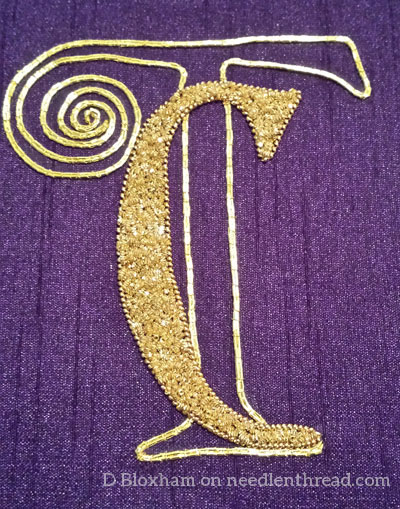
Debra’s question was clear. She needed a very simple monogram design, with a small C superimposed on a larger T. She wanted to avoid floral lettering, since the gift was for an older male friend.
Her plan was to work the design in real goldwork threads. Although she had never done goldwork before, she understood what it was all about, which made it easier for me to help her out.
I suggested she look at the Modern Roman alphabet in Favorite Monograms, since it’s a clean, trim little alphabet with no extra adornment.
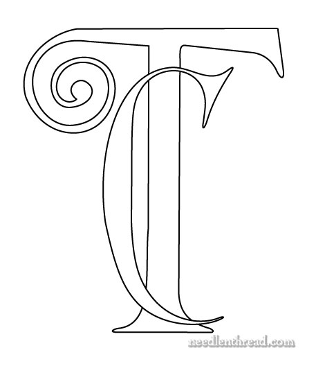
I sent her the example above, on how she could superimpose the C over the T, and she liked it.
A Simple Approach
For stitching approaches, I figured simple is better. For one thing, the alphabet lends itself to a simpler approach. And for another, I knew Debra hadn’t done goldwork before, so I figured simple would be more manageable for her and more likely to end in success.
For the T, I suggested couching gold passing thread or Japanese gold thread just on the outline. You can read about these threads and how to work with them here.
For the C, I figured outlining with a pearl purl and filling with chip work would be a good approach – it would achieve some contrast in the letters and prevent them from being muddled. The whole result would be a simple, clean combination of the two letters in gold. You can read about pearl purl and how to work with it here, and you can read about chip work here.
An Excellent Outcome
Debra took that advice. She enlarged the letters to about 5″ tall and transferred them to a dark purple dupioni silk. The bright gold stands out in beautiful contrast to the ground fabric.
The design is simple and the stitching approach is equally direct. This keeps the project doable in a reasonable amount of time and manageable for a beginner in the techniques. The materials contribute to the richness and beauty of the finished piece, making it an appropriate – and impressive – handmade gift.
The Moral of the Story!
The moral of the story: keep it simple! Embroidery doesn’t have to be complicated to be impressive! I think Debra did a terrific job!
Now, go forth and accomplish equally impressive embroidery feats!
Happy Monday!
You can find the Modern Roman alphabet available in Favorite Monograms, here, along with 15 other decorative alphabets for hand embroidery. You can find all kinds of tips and techniques that have to do with goldwork embroidery in this collection of goldwork-related articles on Needle ‘n Thread.



It looks really rich and lovely!
Lovely! Congratulations Debra (and thanks for sharing your work!).
What a beautiful job Debra did!!! I love the elegance of it and I’m sure her friend did too.
Dara in WV
Dear Mary
What a lovely design I like the way the monograms are integrated and the simple goldwork design it’s lovely well done Debra a great piece of work considering you have never attempted goldwork before which can be quite daunting. Thank you Mary for sharing the goldwork integrated monogram with us and for the advice on keeping a design simple. Beautiful work.
Regards Anita Simmance
Congratulations, Debra! Beautiful work!
Well done Debra! Congratulations for a lovely outcome.
Hi Mary,
You are right, sometimes simple is better. Debra did a beautiful job on her project. The goldwork looks really nice on the purple back ground. By working the two letters
like you did really worked out nice. Loved the finished project.
Happy Stitching
Louann P
Thank you Debra for sharing your work with us, it is lovely. And thank you Mary for explaining the process. I have a question about embroidering initials. How do you work out the placement of each? For example my initials are J A S (Judy Ann Sheppard) if I wanted to use 2 or all 3 in an embroidery are there any rules for the placement of each. (knowing that rules can be broken gg) I have seen 3 initials placed side by side with the centre one larger, is that the 1st initial or the initial of the surname? I have seen them sort of stacked on one another again usually with one larger, which initial is the larger? I am presuming the surname initial would be the more prominent? I have also seen 2 initials both the same size but one was a blocky script and the other a cursive script curled around and through it. I hope you can understand what I am asking as I would love to do some monograms, but have shied away from them for this reason.
Cheers Judy
SE Queensland, Australia
Hi, Judy –
Most of your answers can be found in this blog post: https://needlenthread.wpengine.com/2014/06/manipulating-monograms-to-create-hand-embroidery-designs.html
And you might find this one interesting as well: https://needlenthread.wpengine.com/2014/08/initials-ciphers-monograms.html
Hi Mary,
Thank you for the information. I do remember reading the second, but I somehow must have missed (or it went in one ear and out the other so to speak gggg) the first one, I have now made a note in my files.
Thanks again
Cheers Judy
SE Queensland, Australia
Chip work! Never heard of that before — it is fascinating. Love that idea for this design, too. The finished piece must have looked stunning. Thanks for sharing, Mary!