


The embroidered E monogram that I showed you on Tuesday is finished, so today, I’ll show you the final details and discuss some of the stitching and some ideas for future modifications.
This is one of my favorite monograms so far in this recent splurge of monogramming.
Well… I should say it’s been one of my favorite “classic style” monograms to stitch. The voided floral monogram was actually the Most Fun Thing Ever to embroider, but this one – I like the results over all and I like the stitches involved in it.
There were some sticky spots, though, and there are some areas on the E that I’d like to do differently, in another version of the letter.
So let’s take a look!
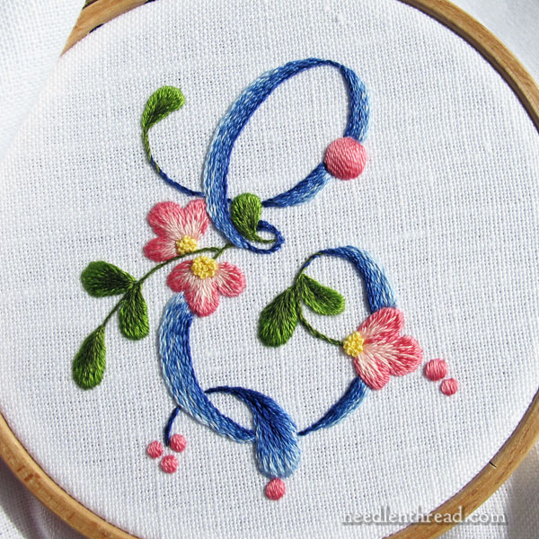
In Tuesday’s discussion on how to embroider this monogram (you’ll find all the stitch details, thread information, and so forth in Tuesday’s article), many of you suggested that the “tongue” at the bottom of the letter should be green and not blue.
Well, I agree! But by the time I wrote that article, I had already started on the blue, and so… I went ahead with the Blue Tongue. I always avoid picking out when I can, you know. I’m just lazy that way!
My plan is to embroider another letter from this alphabet, using some slightly different approaches in parts of the letter, and when I do that, I’ll definitely try a green tongue.
The blue doesn’t look too terribly bad, though – I think it worked out ok!
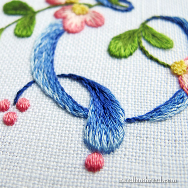
To stitch the “tongue,” I used all the shades of blue and worked it in long & short stitch from the widest part in light blue to the stem stitch tip in the darkest blue. (You can find the color list in this article.)
I stem stitched half way up the center of the tongue, following the stem, using the darkest blue. You can’t see it so well in the photo, but if you click on it for a larger version, it should be a bit more evident.
Padding the Long & Short Stitch
With all the long & short stitched elements in this project, I outlined along the design line with split stitch in one strand first, and then worked the long & short stitch over the design line, to help create a little lift on the edge of the element and to help ensure nice, smooth edges.
Because the flower petals and leaves are relatively small, the long and short stitch is a bit bulkier than, say, a satin stitch would be. Because of this, they might look a little padded. They aren’t padded – they’re just outlined under the edge.
On the tongue, though, I wanted to maintain that same look of thickness that the other long & short stitched elements sport, but on a larger element, the outline underneath won’t do the trick. So, on the tongue, I stitched in some straight, horizontal padding stitches inside the split stitch outline (using two strands of thread) before working the long and short stitch.
This helped maintain the “lift” found in the other smaller elements.
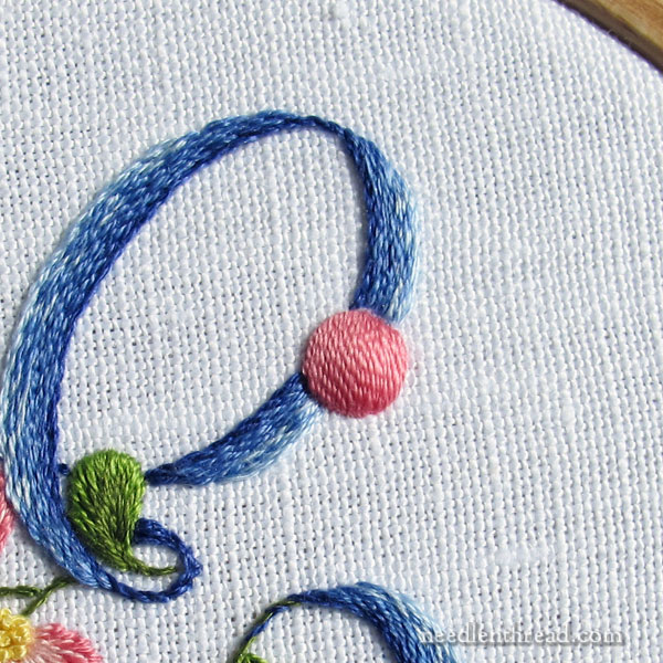
Speaking of padding, the large pink dot on the top of the letter is padded quite a bit, to make it nice and plump and round.
This tutorial will help you learn how to stitch a nice round satin stitch dot. When you work the padding inside the circle, this tutorial will show you how to stitch the padding without getting a heavy build up on the back of the fabric.
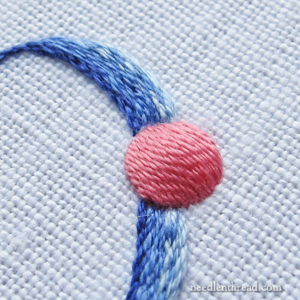
When working the satin stitch on the dot, I used one single strand of floss. Using one strand in the needle takes longer, yes, but it creates a much smoother satin stitch surface.
That Solid Pink!
Now, about the dot….
You know, it doesn’t really thrill me. Oh, it “goes” with the letter, but…but….
I think what I don’t like about it is that it is a solid, Pepto-Bismol pink, while the letter all around is sketchy and a bit heathery.
Contrast is not necessarily a bad thing, but in this case, I’m not sure I like it. I suspect I would have liked the dot better, had I embroidered it in the lightest blue. It would have blended with the letter better, and maybe even looked a bit like a pearl situated on the script. The pink just really Stands Out.
But that’s ok, because I can experiment with other ideas on other letters! That’s the great thing about monograms – they’re such nice, small, contained projects, and they work up pretty quickly!
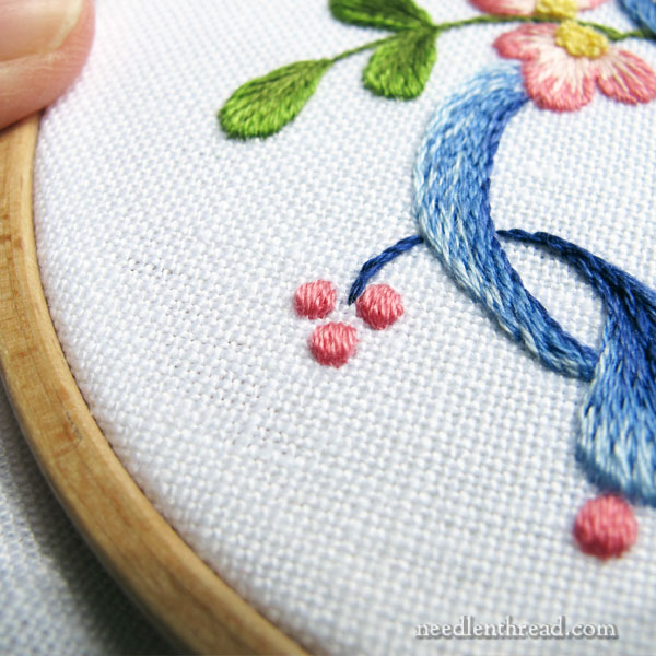
Probably the hardest part of the whole letter to get right were these tiny dots. They took a lot of concentration and they required magnification, too.
Tiny Satin Stitch Dots
It’s very easy to overdo it on a tiny satin stitch dot. The key is to go for minimum satin stitches. It doesn’t take many to cover this small of a dot.
All of the satin stitch dots on this piece have a split stitch outline underneath them, even these tiny ones. The split stitch outline helps round out the dot, so it’s definitely worth split stitching an outline first before working the satin stitch.
For all the little dots, I didn’t build up any heavy padding, but instead, I worked one layer of horizontal straight stitches inside each dot, filling the inside of the split stitch ring, before satin stitching.
Instead of Satin Stitch…
If you’re intimidated by the satin stitch, you can always fill the dots with French knots, mirroring the French knots in the centers of the flowers. It will add a little texture to the piece – it won’t look the same as the satin stitch – but I think it would look good!
Try It!
If you want to try your hand at stitching this monogram, or any of the monograms I’ve been covering recently here on Needle ‘n Thread, you’ll find them all available in my e-book, Favorite Monograms.
You can also find several of the alphabets available here on Needle ‘n Thread for free. They’re not all available as printable PDFs, but you can always download the image, print it and trace it if you want.
If you want a good book on classic monogramming, check out my review of Monograms: the Art of Embroidered Letters. It’s an excellent book and the review will show you exactly what’s in it.
I think it’s beautiful! If you REALLY aren’t happy with it, you can always send it to me. It would make a lovely addition to my sewing room. =)
Thank you for sharing your talents. You are an inspiration and some day I’ll be able to do work as lovely as yours.
Not that you asked me but … I think the top left leaf should have been blue and the tongue should have been green – that would show which are part of the letter and which are decorative accents. However, I could not have stitched such a beautiful monogram so I could be wrong.
I’m sure you were thrilled to have us all chiming in about the green, when you were already stitching the blue!
It is still beautiful, and I don’t mind the pink dots at all. If the tongue were green, then the pink dots might have looked more out of place, so I guess there is always give and take!
Good morning Mary. When I first pulled up your email, I was delighted at how the monogram had turned out. After reading your observations I only think I would do the large Pepto Bismol dot differently as you spoke of. I do not see the “tongue” as a tongue and I think you finished it perfectly. To me it looks like the finishing swirl of the E. To do it in green I feel would be jarring.
When I started to really dabble in embroidery I loved doing the satin stitch. I never edged what I was doing. Much later when I heard of doing the split stitch around what you planned to do satin stitch on I thought it would be a waste of time… until I tried it. That one step makes all the difference in how your piece is going to look. Keep spreading the news.
Mary I think you E is a success!
Love how you layered and textured the blues in the “E”, Mary. Question: for those small dots, could you have outlined the circle in, say backstitch instead of split stitch? If it was going to be covered, would it matter? I’m thinking, for myself, that a small dot like that might be easier to outline in backstitch rather than splitstitch.
Hi, Maureen – it’s actually easier to get a very smooth round circle that’s that small, using split stitch. While back stitches would be easier to stitch, I don’t think the circle would come out as smooth. But no harm in trying it!
Absolutely lovely.
Hopefully an easy question. How do you decide which letter to embroider? Do you do letters with a person in mind or just decide it would look good embroidered? I’m trying to decide which letters to monogram. Thought perhaps doing a set of different ones with an R for our last name, or assorted first and last initials for hubby and me, or perhaps all of us including the kids that no longer live at home. I would hang them all together on the wall.
Checked out the antique pattern library and found a lot of monograms and now understand the cleaning up to do that you have mentioned. We are so fortunate to be living in this age of abundance of ideas and patterns for crafters.
Hi, Gailete – I usually choose letters based on people I know or people in my family, so that I can feasibly use them for gift giving. Otherwise, I’d have a lot of disconnected letters hanging around, and nothing to do with them!
Dear Mary
What a beautiful E monogram and I like the blue tongue as you call it. The pink dots are equally lovely and I don’t think a different way of embroidering it would make any difference to the already lovely project. The pink flowers are so pretty and blend in perfectly with the blue thread of the monogram. Thanks for sharing with us this lovely project and for more wonderful ideas on stitching monograms you are so creative. I can’t wait to try these different styled monograms sometime soon.
Regards Anita Simmance
Hi Mary! E is for exquisite & elegant! Thank you for sharing. Can hardly wait to see an S. ;-).
The plain pink colour on the big dot lets the real light and shade from the padding have full play. Which is good- that’s why it was padded, isn’t it? As for the tongue- well, maybe it ought to have been green as a part of the foliage, but the blue stops it becoming too intrusive. With the flowers and the pink dots to draw the eye away, it fits in with the swirls of the letter. I think you made the right choices.
I think it is very pretty! I don’t think the “tongue” actually looks like a tongue anymore, now that you have made it blue. However, I think the design would look cleaner if the “tongue” was removed altogether. I think the pink dots are quite cute, and the heathery blue is gorgeous. Regarding the dots, I recently read an old instructional letter from you regarding Rhodes stitching to make puffy round berries. Do you think Rhodes stitches would have worked here for the dots, or would they look too casual for the classy letter E? Thanks for sharing your beautiful work, as always.
Yes, I think the Rhodes stitch would work, but it might be a bit crowded on the tiny dots. Worth trying, though!
When so many experienced needleworkers have suggestions/questions about a work, perhaps the design rather than the execution (exquisite as usual) needs tweaking. Might the E be better without the big, pink pill and the hanging tongue at the bottom? Just sayin’.
As ever, Mary, another beautiful piece of embroidery. I think you’ve mentioned in a previous article, that you haven’t scaled these letters up when you print them out, i.e., the monograms are approx 2.5″ when you embroider them? I’m currently tracing some of the letters from your PDF’s…and 2.5′” seems tiny! The photos you’re showing us seem bigger – or is that just down to your excellent camera skills? I wonder if you could sometimes take a full shot photo with something next to the letter ( a pair of scissors maybe), to give us an idea of scale?
I’m planning on taking some monograms with me on holiday next week, to stitch next to the pool!
Thanks for all your time and hard work,
Suzi.
Hi, Suzi – that’s right, they’re not scaled. When I take pictures for the website, I get pretty close up, so that you can see the details. All of the monograms are in 4″ hoops, so that should give you an idea of the scale. I think you can see part of my thumb in the last photo above. :-/
Hi Mary,
I’m taking the Sketching with Thread – Exercises in Mark Making at the San Francisco School of Needlework in late September. I’m hunting around for a project to do marking around, in a void. Do you think your Modern Roman letters would work for this?
Hi, Holly – I think it depends on the type of stitching around it. There are some parts of some of the letters that are very narrow lines. But yes, I’d definitely try it for a voided monogram. I’m planning on using one as a voided exercises, but again, it just depends on how you approach it.
Lovely piece of embroidery! I like the blue “tongue”, I think making it green would be too much green in the piece. Besides, it’s not really a leaf. Since you wrote so much about the large pink dot it’s now all I can see. I do think it is too big to be a solid color and maybe it would be best left out altogether.
Hey Mary,
Is it possible for me to hand embroider a dot using a satin stitch near or on an existing monogram – (on a sham)? I would love to add interest and a contrast color.
Many Thanks!
Ps. This is for my home – not a client …I’m too new to embroidery to try for a customer/client
Hi, Tracy – I do dots a lot. You can add them anywhere you want! On an existing monogram, if you’re embroidering on it, you’ll need to outline where you want the dot – preferably with split stitch – and then add at least one layer of padding inside the split stitch before the final layer of satin stitch. Go easy! I think you should try to get a good feel for the previous stitching, to make sure it makes sense to stitch on top of it. If you’re working next to a monogram, no big deal! it’s like any embroidery, really, on blank fabric. Good luck!