The last time we looked at the Secret Garden Embroidery Project (quite a while ago!), we looked at this wee section of the tail of the hummingbird, embroidered with a variety of stitches.
I wasn’t going to publish the list of thread colors for the birds until I had completely finished at least one bird, but here I am, succumbing to persistent requests for the DMC thread color list for the colors used so far on the hummingbirds!
Just keep in mind I haven’t finished the bird yet. These are the colors I’ve selected, though, and I have used most of them so far. There may be one or two that I don’t end up using, and there are a few neutrals not listed here that I’ll play with for the beak and perhaps for some parts of the wing.
So, at this point, I’ll note the colors I have used, the colors I haven’t used yet that I may potentially use, and leave it open for adding a few more neutral colors or “accidental” highlights as the rest of the bird develops.
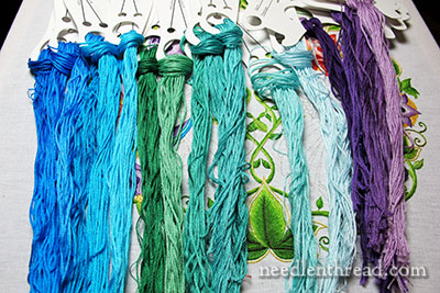
These are the colors I’ve used so far on the bird.
You can also throw basic black (310) in there for the eye – I forgot that one!
In my mind, I have these grouped five ways, from right to left: purples, very-lights, turquoise-ish greens, green-greens, and vivid blues.
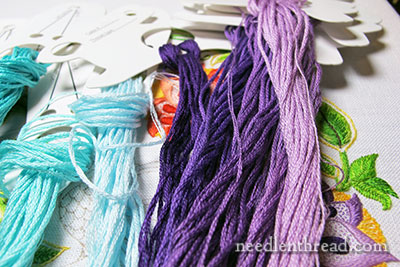
The purples are the same purples I used on the flowers. From dark to light, they are 550, 3837, 552, 553, 554.
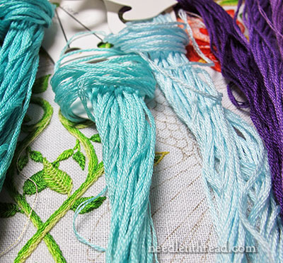
These “very-lights” are two very light options that blend well for highlights with both the turquoisey-greens and even the green-greens and vivid blues.
The one on the left is the more green of the two, and it is DMC 964. The one on the right is more blue, DMC 747.
Both of these make up the majority of the light parts of the head of the bird, and they will show up again on the wing.
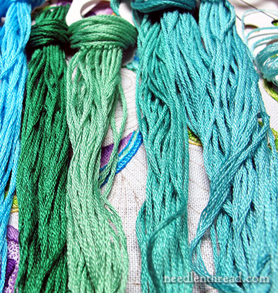
The turquoisey-greens are on the right here.
They are 958 and 959 (the two on the far right), and the one in the center that’s a little brighter (kind of a cross between turquoise-green and a peacock green) is 3851.
The green-greens are on the left. They’re 910 (dark) and 913 (light).
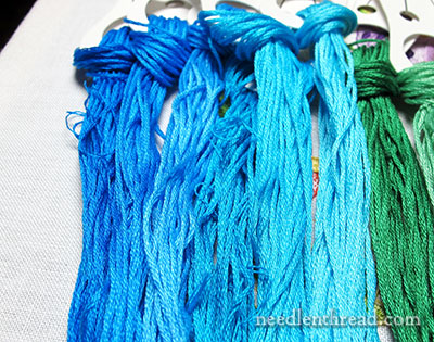
And here are the vivid blues, and they are really vivid!
They’re actually two different color groupings. The four on the right (next to the greens) are (from dark to light) 3843, 3844, 3845, and 3846.
The two Really Vivid Blues on the end are 995 and 996.
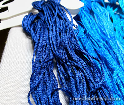
If I need an absolutely dark but bright blue for shadows or shading, I will mix in one or the other of these two blues: 796 or 820.
Of all the colors listed above, the only ones I haven’t used are 913 (the light green-green) and these two last very dark blues (796, 820).
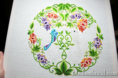
This is still where I am right now. I did test a few ideas on one part of the wing, but I picked it out right away. Today, I’m going forward with a different approach!
The Colors in a Convenient List
If you’re following along with the project and you’re interested in using the same colors I’m using, here are the numbers, numerically arranged, to make it easier to select your threads:
310, 550, 552, 553, 554, 747, 796, 820, 910, 913, 958, 959, 964, 995, 996, 3837, 3843, 3844, 3845, 3846, 3851
If you’d like to follow along with the Secret Garden Hummingbirds project, you can find all the articles relating to this project arranged in chronological order in the Secret Garden Project Index.


Dear Mary
Although blue is not my favourite colour I really like the vivid bright colour groupings you have chosen for the hummingbirds which reflect the brightness of the bird you have embroidered so far and compliments the lovely lush green leaves and the bright colours of the embroidered flowers and blends in beautifully with the stitches you have chosen on this design. A really beautiful piece of embroidery. Thanks for sharing the colour groupings for the hummingbird with us and I look forward to your progress on this project.
Regards Anita Simmance
Hi, Anita! I’m looking forward to a little more progress on this, too. It’s going so slowly! Hopefully, this afternoon, I’ll spend a couple hours stitching. Must finish those Saturday chores first, though! And catch up on my other neglected things…..
Good Morning, Mrs. Corbet. Sorry for the silence it’s just that I’ve still got this cold to contend with. I think it’s extraordinarily generous of you to give readers not only the stitches but also the colors, and materials you use.
I’m not so generous, I wouldn’t want anyone copying me because then it wouldn’t be my piece! I’m quite a selfish wretch aren’t I? What can I say, you’re a remarkable lady. I hope your new idea works better than the first, but I’m certain the first was lovely too.
Hi, Kristina – sorry you’re still contending with the cold! Hope it clears up soon.
No, I wouldn’t say you’re a “selfish wretch” – there aren’t too many designers who share everything from start to finish in public, and guess what? I don’t either! I have certain projects that I work on for the website that I share on the website. And then I have certain projects that you might get a glimpse of on the website, but that I don’t share from start to finish, because they’re meant for some other purpose. I think that’s quite all right, don’t you?
~MC
More than quite all right! You are a true artist and anything other than your original piece is just a copy. Not that, I think that’s “wrong” I absolutely do not! How many artists flock to the world’s cities and copy views that the Masters painted centuries ago? My personal aversion comes from the desire for all of us to put our own mark on the project. That’s why I love how you set up the Flicker page.
So glad you are now well enough to contemplate stitching again! I’m intrigued by the colour choices: the purple picks up the colour used in half the flowers – does that mean the second bird will have a bit of red? Or is it too soon to say?
Hi, Elaine – Well, I’m not sure about the red family yet. Too soon to say, I think. It looks odd as a highlight even, with this particular color palette on the birds!