The last bit of silk embroidery on the Mission Rose project is finished!
At least, I think that’s the last bit… I may do some silk embroidery in the corners of the design, but that’s yet to be decided. I have some other ideas stewing for those corners.
Despite all the hemming and hawing I did over this bud, I finally did finish it, and you know what? It’s not as bad as I thought it would be. I’ve grown somewhat fond of the little thing.
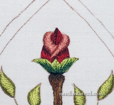
Here’s the bud, close up. I worked the body of the bud in long and short stitch, in two shades – the dark red under the petal turnover and the rest in the bright red. The tip of the bud is worked in bright red, with a few dark red stitches sketched in where the inner petals overlap.
The petal turnovers are embroidered exactly as the petal turnovers on the rose – in very padded satin stitch. The turnover on the left was stitched first.
The leafy bit under the bud – the sepals – are embroidered in long and short stitch in the same three greens used on the large leaves down below.
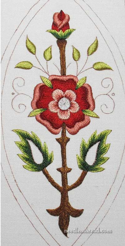
Progress thus far! What think ye? Be honest! Like it, hate it, wonder about it? Did you raise two eyebrows? one eyebrow? or frown when you saw it? Have your say below!
Next up is experimental. I’ll be experimenting, and if the experiments work, I’ll show them to you. And if they don’t work… I’ll probably still show them to you.
Onwards and upwards!
If you’d like to read the backstory and follow along with the development of the Mission Rose project, you’ll find all the articles in this series listed in chronological order in the Mission Rose Project Index.


Ah, it’s quite cute, isn’t it? It has worked much better than I expected – the greens pull the whole design together nicely. Looking forward to the experiment (I see some intriguing markings in the middle of the rose….)
Hi, Sue – Thanks! Yes, it worked out better than I thought it would, too… The markings in the middle of the rose were just the “angle” markings for the long and short stitch – just radiating lines from the center. They’ll be covered when the goldwork is finished. I’ve got a couple ideas for that area, one of which is to stick with the technique that was used in the original – kind of “heaped” chip work. We’ll see!
Dear Mary
I really like it, it looks beautiful I love the bud and the colours go so well with the green leaves and the brown stem, I can’t wait for the experimental work. Looking at the completed stitching It looks so pretty I feel like following you and taking up this embroidery project.
Regards Anita Simmance
Thanks, Anita! I’m glad you’re enjoying it!! ~MC
Mary…
I’m not particularly fond of the bud… too much padding I think on the turnover… looks more like a pink fur collar. I love all your experiments but this bud made my eyebrows raise.
Overall, I think the piece is coming together really nicely. The bud is beautifully stitched. The shadow effect at the edge of the turnovers is because they’re so heavily padded rather than some darker stitching?
But I’m still thinking the turnovers look a bit like a boa around the bud. After staring at it for a while I decided it looks like that to me because if your eye follows the line up either side of the outside of the bud, the line appears to continue at the same angle for the point of the bud. Suggesting that they are the same petal and the turnover is something wrapped around. I’d have to study some pictures of actual rose buds to see how it might be done differently. But if it was mine, I’d say fine and move on. It’s a stylized image.
Yes…the boa! I have to admit, I think of that, too! At least I didn’t make it fuzzy, with Turkey work or something, eh?! The shadow effect on the reds is due to a darker thread. The shadow effect on the pink is from the height of the padding. -MC
It all looks like perfection to me. The bud draws my eyes up and away from the center rose. I’ve saved the article in case I ever embroider such a project.
Off the subject, when you have give-a-ways, how is the winner chosen? Is it how well & detailed their comment is? Thank you
Hi, B – actually, no, it has to be done randomly – Otherwise, it would just be too hard to pick a winner, and too much subjectivity would come into it. But I do make sure that I’ve weeded out entires that are double entries, or that don’t answer the question at all. Short comments like “thanks for the giveaway” (and nothing else) are not counted in the draw, because they don’t follow the guidelines. Hope that helps! -MC
Oh Mary!! This is looking so fabulous!!! Well done you!!! 🙂
Thanks, Brigette!
OMGosh, I love the bud! It’s beautiful! I love the way the entire piece is turning out.
Thanks, Pam! 🙂
This was a one-eyebrow situation for me. My first reaction wasn’t ‘pretty rosebud’ , it was ‘weeble wearing a pink fur stole’. The pink just looks too …separate, maybe? Contrast-y? I don’t understand, because the rosebud as you drew it looked fine to me and I thought you were worrying too much about it. And the large rose looks perfect with the same colors.
I’m perplexed now, this is going to take a fresh cup of tea.
Mary, Love the rose bud(boa)! As you said before it’s a stylized interpretation of a rose not a natural one and I think it’s great. Can’t wait to see how you pull the Dr. Seuss mitts into it but I’m sure whatever you do will be wonderful(I just want to put a smiley face in those holes). But, your eye is much better than mine that’s for sure. Does that come with practice and experience or is that just talent? Cause I don’t have it and I want it.
Hi Mary,
The bud is beautifully stitched and the colors are lovely, but I’m in the “fur stole” camp. It looks to me like a but wearing a stole. Maybe if the light pink had some red shading in it it would look more natural. I realize it is a stylized rose, but this is a bit too stylized to my way of thinking. Will there be any gold around it?
I think it is wonderful. I admire your choices and your work. thank you for a wonderful site.
Ever since you mentioned the Dr. Suess thing, I have not been able to keep a straight face when I see this piece…keep thinking about Thing One and Thing Two…and I have to be truthful – this one is just not quite ‘there’ yet for me. But it’s not finished yet – so no dislike, no woohoos – still a W.I.P. and of course, the workmanship itself is beautiful as usual. Just not sure about the whole…Is this a ‘useful’ item – does it have a ‘purpose’? What is it for? Knowing that might make a big difference in how I ‘see’ it.
Dear Mary:
I love the little bud just the way it is. I have been cheering for it all along and now it is finished, I love it even more. Anyone who is going to do the Mission Rose project and is not entirely happy with the bud is free to embroider it differently. Yesterday I went to our Capitol’s Art Museum which has everything from ancient to modern, primitive to abstract. It was good to re-afirm that art in all it’s forms is the vision and interpretation of each artist. The art of embroidery is the same thing, design is individual.
Susan (S. Raleigh, NC)
It is simple and superb. A smart selection of color. I will love it even without gold.
To my eye it looks you could have put just one more stitch on the top left part of stem just below the flower. But that doesn’t make impact the beauty of the work !
Les points rouge foncé dans l’extrémité du bourgeon sont tout-à-fait intéressants car ils donnent l’impression que le bouton va s’ouvrir. C’est donc une très bonne idée !
Merci! 🙂 ~MC
Oh dear. When I first saw the finished bud, I thought it looked much better than I had thought it could but when I had another look I think the pink fur stole jumped out and scared the be—– out of me. Sorry Mary, I don’t believe I have felt in the least critical of anything you’ve done until now, although it isn’t really critical.
I wonder whether it would be better with a tad less padding and perhaps in a colour closer to the red, ie, less ‘pink’. I hope this makes sense to you and that your feelings are not too bashed and battered.
Overall it is looking really splendid, I just wish I had stopped at the first look!
Great way to do a bud!
Mary:
I absolutely love the Rose you have finished. I think you were most cretive with it and even tho’ you had a hard time deciding just what and how, I think it turned out beautifully.
I really do not like the blue on your rose project. I think it detracts from the stand out quality of the rose. I would prefer a dark green or something to emphasize the rose itself.
Mary, I have been reading the comments as they come in, and I am now totally confused. A couple of the comments make reference to ‘blue’ but I can’t see any. As I recall the background is pale pink, and the rose and the bud are both red and pink, the stem is brown and the leaves are green. Please correct me if I am wrong, but I just can’t see blue anywhere. Nor can I recall your mentioning blue as a possibility for the corners or the border. Help!
Hi, Christina – well, the blue is showing on today’s post, which is the first one on the home page. Your comment here is on the last one about the bud, but today, I posted about the blue appliqué fabric around the perimeter…. Check the home page! http://www.needlenthread.com
Dear Mary,
a hearty congratulations on the Mission Rose embroidery project. I did mention in an earlier email my reservations about the colour of the stem and I am sorry to say they are still there. I feel that the original piece had a subtlety which the browns don’t have; that is, however a personal opinion stemming from my love of the pre-Raphaelite brotherhood’s work. I look forward to seeing the next step in this project.
All the best
Michael
Amazing!
Gorgeous! Love it!!