


The last time we looked at the Secret Garden Hummingbirds, I proposed a little color controversy, polling you all for your opinion on adding red to the second hummingbird.
Many good points came from that conversation as you chipped in with good advice, approval, or disapproval! And a couple questions arose, too, two of which I’ll clear up today while showing you a wee bit more embroidery progress on the birds.
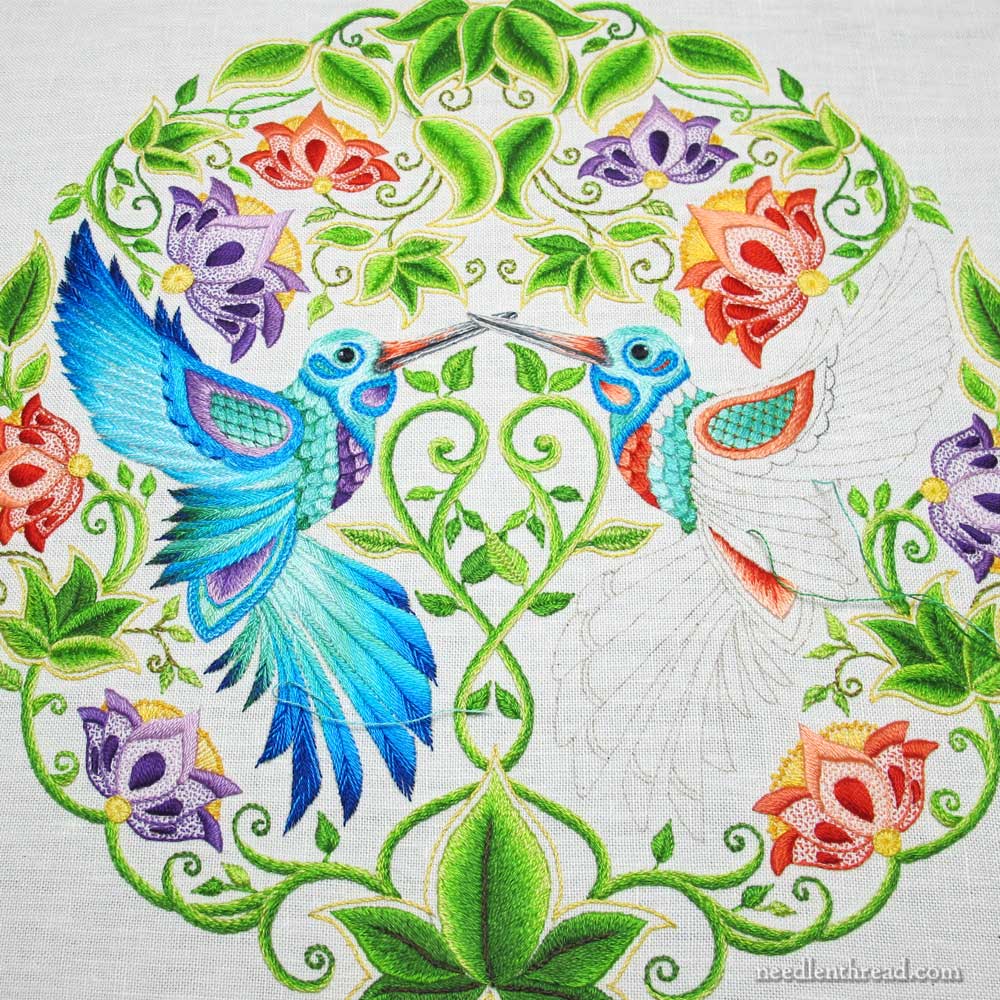
If you click on the above photos, you’ll be able to view the embroidered hummingbirds much larger. Viewing them small, though, as the picture looks on the website, will give you an idea of what the whole embroidery looks like, if you were standing a little distance from the piece, as opposed to viewing it with your face up close to it.
When I’m trying to get a sense of color balance or color placement or whether or not a particular color is actually going to work on in a particular setting on a piece of embroidery, I do two things.
The first thing I do is back up. When I stitch, my face is often within ten or twelve inches of my needlework. If you happen to use a magnifier when stitching (which I haven’t found necessary on this piece, but on some pieces, I do use one, if the stitching is particularly fine or detailed), then the importance of backing up is more pronounced. You get a better sense of the whole picture if you move back a bit from it.
The second thing I do? I squint. I don’t know if it’s a very professional thing to do – to look at your work through the blur created by squinting – but I find it helps me see colors only, without necessarily seeing the detailed picture. It gives me an idea of the colors and where they are and what’s around them, without having to concentrate on seeing the details of the setting.
By stepping back and by squinting, I get a better idea of color placement and color balance.
So, back to the two questions I want to clear up regarding the second hummingbird.
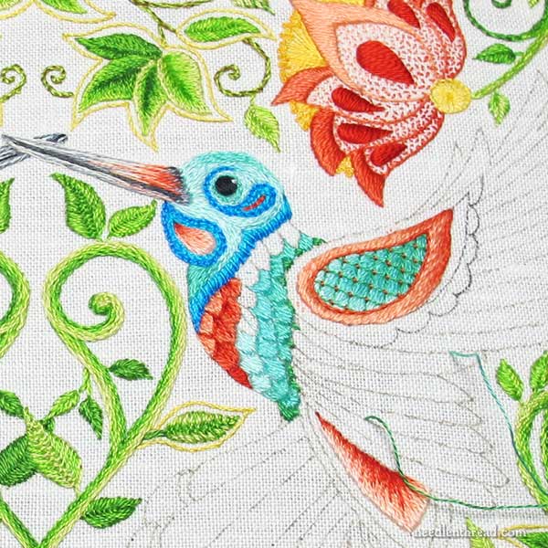
The first is the notion that the whole bird on the right will be worked in reds. This isn’t the case. The whole bird will be worked just like the bird on the left, but everywhere you see purple on the left, you’ll see reds / corals on the right.
The second is the notion that the piece will end up unbalanced because the red bird is overshadowed by the large red flower and the purple bird is overshadowed by the large purple flower.
Maybe, if I had thought about it way ahead of time, with the flowers situated as they are, I might have embroidered the left bird (the purple bird) with red highlights and the right bird (the red bird) with purple highlights. That would have continued that alternating cross balance found in the flowers.
But – woe is me! – I didn’t think about it far enough ahead of time.
My original plan was two mirrored hummingbirds, both with purple highlights. The red was a last minute whim.
But it’s a whim that works. Besides the fact that I like the red (personally, because I just like red), as far as the balance goes, if you squint while looking at the first photo above, you’ll see that it doesn’t really throw the piece off. There’s still that alternating cross balance in the flowers, and that balance in the frame works to hold the birds in balance, too. I thought it might end up looking lopsided, but I don’t think it will.
I think we’ll know better about the balance once the blues are finished. But at this point, I’m thinking it’ll work fine. What do you think?
There are a few details on the red bird that don’t perfectly mirror the purple bird. The lattice on the wing is closer and at a slightly different angle, for example.
I outlined the inside section of the wing with a darker red, which I didn’t do on the purple bird. The red shaded part of the wing looks pretty shoddy right now, but that will improve when the surrounding area is finished.
And the red bird has a little extra red accent on his cheeky little cheek.
Today, I’ll make some more progress on this fellow. My plan is to finish the breast and the top part of the wing today during my Hummingbird Time.
Tomorrow, a stitch tutorial! It’s a fun one!
If you like, feel free to weigh in below with your opinion on the red and the balance, now that there’s a little more color on the hummingbird!
The Secret Garden Hummingbird Project began in 2014, and it is documented step-by-step here on Needle ‘n Thread, if you want to follow along. You’ll find all the articles relating to this project arranged chronologically in the Secret Garden Hummingbirds Index, along with information on where to find the design, the materials and threads used, and stitching details.
I would recommend you take a picture of it and look at it. I find that if I’m questioning a stitch or color a photo will really make things show up or not…
I get your plan to change the “original plan.” That happens to me all the time. I think it will look fine either way you complete the project.
I like it! I think it’ll be an interesting contrast and tie in with the red flowers. It’s funny bc I never would have thought that a teal and red hummingbird would work as well as the teal and purple, but I was wrong!
I like the red! It lifts the piece and balances the colors of the whole piece. Looks great!
Squinting tends to reduce the colour in vision, so you can see the TONAL balance of the piece, rather than being distracted by the relative brightness of the colours. It’s a good habit. (These days it’s easy to take a small photo and look at it in black and white.) Another tip for colour balance is to look at the piece upside down and/or sideways. And the old favourite of coming back to it in the morning and looking from a distance, not focusing on any part of the design, just looking at the whole. Anything that passes all of those tests is likely to be very well balanced indeed.
I like the way it looks; the red warms it up very nicely!
OH it is going to be sooo BEAUTIFUL. I didn’t relize before that the red was only going to be where the purple is. Such a good idea you had. Have you ever tried the quilters tool that we use for checking the light and dark values,I use this before I start a piece. I lay out my thread I plan on using and check to see If I am happy with the contrast between the colors. You didn’t need it here you did great.
When I squint (which is, by the way, what my design fundamentals professor in college taught us to do, for exactly that reaon, to get a sense of color contrast without the lines and pattern dividing it up. Also, quilters often squint when choosing fabrics for a quilt.) the balance is quite nice. My only concern would be the fact that the purple kind of blends with the blue, whereas the red is more contrasty. But I think in the end the balance will be just fine. Course red is my favorite color…
Good Morning, Mrs. Corbet! I hope it isn’t nearly as cold in Kansas as it is here! In my humble opinion the piece is balanced because the red flower is above the red bird and the purple is above the purple bird! Symmetry is gorgeous! I originally thought the birds had to mirror each other perfectly. That’s my OCD talking, but this perfectly proves my neurosis wrong! My only minor quibble is that I still think that the purple in the bird is too ‘cool’. But still, he’s GORGEOUS! So, that just proves I don’t know anything!
Keep charging along in this project, Mrs. Corbet. Follow your heart, and artistic bliss. It’s YOUR art.
I learned that squinting technique in design school! It works!!
I say, if you like the red, Mrs. Corbet, go with it! It’s your embroidery! (and it doesn’t look bad besides)
I like the purple bird with the purple flower and the red bird with the red flower. I think it adds stability. And besides, if you had flipped them, you would have had the same issue with the flowers by their tail feathers. I think this will be a lovely, well balanced piece. I enjoy watching your progress.
Just one comment – the red in the bird to the right changes the color read for the aqua that you used.
Oh, Mary, how I hate to disagree, but I do not like the red in the new bird. By following your suggestion I can see that so far, lack of balance isn’t the issue. For me, the issue is how spectacular the blue bird is and a mirror image or even a slight reworking of the blues and greens would have kept the piece in greater harmony for me.
However, I am both a “blue” girl and a very “symmetrical” person so take that into account with my words. I am not fond of red.
I have learned since I was a child coloring not to squint but to do something that I have called “put my eyes out of focus” when trying to judge my artwork. So happy to hear that someone else does somewhat the same thing. It has always worked for me.
Your piece is gorgeous.
Floss
Each of us is unique, so it is unreasonable to expect each bird to be an exact copy of the other. I like the way the red accents in the place of the purple accents looks already.
I’ve always liked the idea of the red. I disagree that it unbalanced the overall effect. Your moment of whimsy is leading you down the right path for this project.
Dear Mary
I have heard of squinting at your work before I think by squinting you see the colours better. I really like the reds on the second Hummingbird and I think the reds really enhance the piece. I don’t think it matters that you used red thread next to the red flower I still like it. Thanks for showing us your progress on the Secret Garden I can’t wait for further progress. A short reply today as I’m not feeling well it’s that time of year, sore threat etc.
Regards Anita Simmance
Ut oh! Get better soon, Anita! It’s a lousy time of year to come down with a cold and sore throat. But a good excuse to stay inside, stay warm, and pamper yourself a bit! Get plenty of rest!
Dear Mary
Thanks for your post and yes I will stay inside and warm although it’s a bit boring I really want to get going on my embroidery project but I’m feeling to weak to start but, hopefully I will be able to get started on the weekend.
Regards Anita Simmance
I think I am liking what is happening. After all no two birds are exactly alike and the male and female often have a very drastic difference. The flowers, over all aide in keeping the whole garden balanced. When the remainder of the bird if finished, all will be pleasantly surprised. Keep up the wonderful work.
I really like it, I think the alternating flowers look good as they are as each bird does have a contrasting flower next to it as well as a matching one above it. I think the coral and teal colours work beautifully, and yes, the rosy cheek is cute!
Mary…I cannot access my Ask & Share that I registered for about 2 months ago. I need your help…please ask the administrator to contact me, as I cannot see an address for them. Please help.
Hi, Roberta – I responded to your comment the other day, asking you to please email me at mary@needlenthread.com. Thanks!
I thibk they balance perfectly especially because of the alternation of the red and purple flowers. They pull colors in when necessary. Continue with this beautiful piece in exactly the way it pleases you.
I see a beautiful rhythm in the color and pattern of the flowers that I think comes to life with the red hummingbird. I am fascinated with how involved this piece has brought to light the use of stitches and color theory.
I love it. Nothing in nature is perfectly balanced, and yet so beautiful it is always inspiring. This is just gorgeous with so many lovely colors together. Suzie in Idaho
So glad you clarified your wing color plans! I’m feeling much better about the second hummer. It is truly amazing how colors play off one another. The turquoise shades against the red vs the purple look very different at first glance. This is something I will take note of when choosing colors for a project. Thanks for that lesson!!
I really like what you’re doing with the reds and corals. It makes the piece much more lively. When you view the entire design, the alternating colors of the flowers keep it balanced. I’m eager to see it with the second bird completed.
I think you make a good point when you say that we’ll know more about the balance once the blues are in. Right now the reds stand out quite brightly. Once the majority of the bird is done in the blues, it should tame the brightness a bit. The reds will be accents of color again.
As for squinting, all I have to do is take off my glasses and everything goes to a blur.
LOL! Yes, Irene, same with me – if I take off my glasses, I can only see blurs of color. And if I’m back a bit, I can’t discern where one blur ends and another begins. I’ve often wondered what 20/20 vision is like! I’ve been wearing glasses (or contacts) since I was six. I remember getting my first pair of glasses and seeing the individual leaves on trees as we drove home from the eye doctor. I was astounded! And then we went to church on Sunday – and we had a stained glass window in our church – and I always thought it was just color all blended together. I had no idea it was actually a picture!
Mary..I love it when my students experiment with both color and stitch textures…some win, some lose…however, you are no student and an excellent embroideress!
I believe I like the left hummer because the purple blends better with the agua or turquoise and seems to have better depth..perhaps a deeper shade of the red blended in would help. but enjoy…we are..it is going to be a delicious piece. Betsy
Hi. The mirror image would have been lovely and highly formal. And I really love that look because it requires a high degree of competence to achieve.
But something I have learned from you is that a formal look can be achieved with a more dynamic arrangement of line and color. It seems to me (a total klutz with any handcraft) that your current plan will have that dynamism.
I am not a fan of unbalanced visual images; I always have to visually “repair” them unless they perform a clear visual purpose. But I think your plan will produce a lovely, pleasant image and may even create a wonderful surprise or two. Looking forward to your next post!
It seems the vote is positive for using the red family on the second bird. So far it is going to be beautiful and if you continue the plan to use the red family where you used the purple in #1 it should be absolutely gorgeous when done. Go for it !
(1) I love the red! It adds movement and it’s a delightful surprise.
(2) Squinting is professional. I remember my graphic design professor teaching it in her class. She was also a quilter.
Hello Mary,
I recently saw the changes you made on the Secret Garden altering the color of the second hummingbird to red. At first I liked it but the more I look at it the more I think it overwhelms the overall design. The color of the red is so brilliant that your eye is drawn to it at the expense of the rest of the piece.
Thank you,
Sandra
Squinting is a wonderful technique, I use it all of the time when I quilt. I love the way the red it turning out, I think it will look more balanced not less. Great job! And good for you to be flexible enough to change your mind to improve the design.
I think your “whim” is so much more than whimsy. As I mentioned in my first email, I think it’s inspiration. You’ve supported the use of red with strong color theory arguments, but those are secondary to your all knowing desire to use red. Go with your gut. That is what makes art !
I love the red!
I like the red! Like you, I love red anyway. I think it will be beautiful! I agree with Elizabeth Kist; a photo sometimes helps me too, if you have a digital camera. But I also used the squinting technique.
Inspired!!! Two purple birds would throw the whole thing off, the red flowers would be jarring and it wouldn’t balance right. Switching off the bird colors works perfectly. The flower colors alternate and it just really fits well.
One could argue back and forth whether the purple flowers should be next to the red bird or the purple one, but it doesn’t really matter. Truly six of one, half dozen of the other.
Isn’t it wonderful how being open to inspiration just brings it all together?
Mary, another trick for seeing your work in a “new light” is to hold it up to a mirror, thereby viewing it backwards. It’s a trick I’ve used over the years when teaching art to Junior High kids…it enables you to pick out imbalances much more easily.
P.S. – I love the red!
I personally like the color of the birds as you have them and feel like they are reflecting the flower color that is above and below them. Just breathtaking!
Mary, I think your color balance is just right.
It keeps the eye moving and that is pleasing art.
Actually, I like the second bird in red. It (to me) balances nicely with the reds on that side. Yes, I might have done the red bird on the other side, and the purple one on this side, but it lies nicely with the flowers as they were stitched.
And this from a person who wasn’t really thrilled with the project at the beginning. It still isn’t anything I would do, but it has worked its way into something I enjoy looking at.
I liked the red the last time you posted it, and I still like it. I don’t see any imbalance.
Another trick, for those of use “lucky” enough to wear them, is to look at the work with your glasses off.
T
Your choice of red in the hummingbird is brilliant! It would be far less interesting to have the 2 hummers exactly alike. The variety keeps the eye moving all around the birds and the flowers. As usual, your sense of design and color are spot on!
I like the little jolt that comes from not having the left and right sides identically colored. I do think the light reds below the beak are perhaps too light? I feel like that portion is protruding rather than receding, and, at least, for anatomical reasons, it ought to visually recede.
I am admiring your persistence with this project.
Enjoy it all!
I almost did not add my opinion as it is not in sinc with the others. I liked the very lighter shade of red on his bret, but no matter how I look at it, I find the bright red below the lighter red is too dark for me. I will continue to watch and read as I find this very interesting but I loved th hummingbirds, now something is very wrong, in my opinion, and think that i is it. I am very good with color also. however do as you need to as it is your piece and you have worked long enough on worried over this as a mom with SICK CHILD WOULD. GOD BLESS AND PLEASE FINISH IT. i shall be waiting to see it done no matter what you decide. Patricia
I think the reds are gorgeous! The entire piece is marvelous.
Dear Mary, I’m a squinter too when looking for balance. Definitely think you should have unpicked the four purple bits on the left hand bird and substituted the red and vice versa on the right hand bird. If you carry on the way you are doing it
you will have a picture of two halves rather than a balanced whole, I couldn’t live with that. I’m thinking you must know something I don’t know so I wish you well, your work is exquisite.
Regards,
Jenny Wren
Hello Mary, I have been silently following the hummingbirds. I have liked everything up until now. For me it doesn’t matter how much I squint my eyes my brain is telling me – left side purple flowers/red bird – right side red flowers/purple bird. I would do it now before I stitched any more, thereby giving me less to unpick. I do not worry about unpicking on my own projects, I would do it all day if the piece needed it. I am not an embroiderer but a surface stitcher (slight difference in my opinion). I usually graph out an entire project on my computer & play with colours & placement & still find I need to make adjustments as I stitch sometimes. I hope you get lots of feedback & it is positive. These are my own ideas & at the end of the day it is your piece so whatever pleases you. Cheers Ley
I am intrigued by your comment, Ley, about a difference between an embroiderer and a surface stitcher; my mind kwwps play with concepts. What do you see as the difference?
Cheers,
Helen
I don’t happen to care for the red. I think that when you look at the piece as a whole, the red is the first thing that your eye is drawn to. If I would do anything, I would put the red in the other bird as well. It seems unbalanced. When you have a pair of anything, they are usually the same.
I loved the red change the moment I saw it. The red embroidery blends so well with the red flowers, really very nice.
Gorgeous, gorgeous, gorgeous! You know what I think makes the red work? It’s that little touch of red/orange along the beak.
I think it’s stunning and I like the two different colours – more interesting. I use a peep hole like you put in your door to get a distance view and block out the surroundings. Do this when quilting.
If you look at nature, the male bird of a species is often a different colour to the female. They are often much brighter and more colourful. I like what you have done with the Humming Bird in red
I think it’s perfect with the hummingbirds of different colors, it brings it all together for me better than if both were purple (or both coral/red)
I love the red. If the rest of the bird is done in blue it will be perfect. Thank you for doing this project.
Hi Mary,
A happy color choice! It reminds me of the way leaves reflect some of the color of the flowers near them. I really like it.
I like the red. The first thought in my head was oh look, she made a Mr. and Mrs. set of birds. Males are usually slightly more showy. As far a squinting goes, I just take off my glasses and see how it blends together or just put together what I have and live with it.
I’ve just discovered that what I thought was a need for new glasses is an ongoing eye muscle issue and that one eye will no longer come into clear focus. Don’t just ignore or look under your glasses if you are having trouble seeing. It is worth going to the eye dr. to have your eyes tested.
I still like the red very much and you are correct that the intensity is going to change dramatically when the strong blues and greens are added. And yes the symmetry of the piece is still intact and in an unexpected way. It makes the eye flow from the outside to the inside, the heart of the piece, and then back out again. Its a semicircular swoop that actually mimics the movement of a hummingbird, a very happy accident I would say! I like how the united beaks are still the highlight of unity, the true message of the piece. I can hardly wait to see all the colors come to life. Bravo, Mary!
fabulous! I wouldn’t change a thing! Just curious as to the skipping around on the bird….how do you decide what order to do things in?
I like the red- they don’t need to be identical twins but being sisters works!
Mary I feel that your red choice is the perfect fit for this piece. Over and above all the other arguments put forward is the fact that the flowers are warm and cool. The greenery is warm, the birds blue/greens are cool. It is harmonic. For me it is as though each bird is defending its own side of the piece. One warm, one cool.
Equal and even.
I would also love to see this piece finished sooner rather than later. But this is yours to do with as your heart tells you not what we all think.
Love all your work, you are so inspiring.
I did you one better: I sat back and tipped my head down to look over my glasses. My vision is quite blurry without them, so it’s like a super squint. I think in the end the red vs purple effect will be rather minimal, just enough difference to be interesting and lively. I also would have liked the flowers to be opposite the birds of the same color. Oh well, it’s still a stunning piece. Just love it. Wondering if you could look through a piece of glass or acrylic that is blurred in some way, if you know what I mean, rather than squinting.
Happy New Year, Mary! This is perfect. A color masterstroke that separates the true artist from the safer and more mundane path. The balance is exquisite with each bird residing in his own “environment”. Beautiful. As for the squinting, it’s a method I find most informative; insight seems to increase the more my eyes close. Best wishes from Denise
I love it. Perfect symmetry can be lovely, but ‘close’ symmetry gives a bit of spice and character. Either way would look stunning but I do prefer the red accents.
And squinting totally works! We quilters do it all the time, to check for value/contrast. Looking through a door peephole or through the wrong end of binoculars also works well for this. Peepholes are cheap from the hardware store and come in pretty handy.
Squinting is an old technique of deciding colors in quilting, so you’re in great company.
Hi Mary, I enjoy reading your emails each day. If we want to see if a colour matches in a quilt we
use a spy hole the type you get at the hardware store to insert in doors. Thank you for you informative emails I pass lots of your hints etc to my friends when we embroider together. Meriel Huntington
I really like the color balance in this piece. If the Red and Purple Hummingbirds were reversed, I think the the colors would take on a polka-dotted affect. Love the colors where they are now.
I think it’s going to be gorgeous no matter what you do(as always) and only a card carrying perfectionist would say otherwise but I really respect you for asking for opinions. I have 3 concerns. The first is about the difference in color INTENSITY. The reds are much more intense than the purples you used and as a result, they will be more “in your face” than the purple in the finished piece. I probably would have picked less intense, bluer reds for the whole project to tie in the blue/purple/red analogous theme. Second, the VALUE of your accent colors are not the same. The darkest value of purple is a much darker value than the darkest red. It is something I saw right off. And third, the smaller crosshatching would make more sense if the red bird was BEHIND the purple bird. Farther away, smaller details. Because of the way their beaks cross, it would be more logical that the size of crosshatching would be exactly opposite of what you have, closer bird larger details, further bird, smaller details. Only someone who has painted for decades, like me, would even notice it but I did and you asked. When designing a painted piece I place my piece on my printer and make a black and white copy. This is a huge help with my value changes. But it’s a lot easier to change those values with paint than with thread, as I’m finding out as I return to stitching! Again, I think your work is so far beyond amazing I can’t even find a word for it and my concerns are so nit-picky and insignificant that if it was my stitching, I wouldn’t change a thing!
Wow! That was an awesome tour of stitching a hummingbird. I’ll follow this procedure in the exact way you’ve mentioned here. Once again, Thanks. Keep surprising us with such unique and precise stitching. You have earned one more fan. See ya!
I love it! And the red in the second bird brings the red in the flower above the blue bird into the circle. I think it is better this way.
SO Beautiful. I think the purple and red flowers located as they are emphasizes the accent color in each flower’s respective bird without creating any distraction — and adds a bit of action or zest to the appeal of the symmetry. It would be equally beautiful the other way, as others have said, but I really like this combination.
The problem you brought up about the red bird having a red flower over its head & the purple a purple flower would still be a problem as even if you switched the coloured birds around, the purple bird has a purple flower next to its rear as would the red bird have a red flower near its rear. To swap them over would be completely unbalanced as one whole side would be purple & the other side side wholly red. To also swap the flowers around you would have a complete purple side & a complete red side taking all the flowers into consideration,4 purple flowers around the purple bird & 4 red flowers around the red bird. It looks at the moment balanced as the flowers go red,purple,red,purple,red, purple again.The whole balance is to be considered not just sections. To change now would mean changing all the flowers ,not balanced, but the teal blues etc on the birds are the breaking up factor. It is fine as it is.Remember to look at tons of chinese type embroideries on large Empirial coats & cloaks & they are doing the same as you are doing now,It is not a problem , it is a balance. Marion BP
mary, I do really like the way you have done it all. Sadly I got lost along the way on mine and have not touched it in something like nine months or so. I just lost stem on it an started other projects one thing and another. I love your site and all you post. I just wanted to thank you for all you do. David
Thanks, David – I’m glad you enjoy it! Don’t give up on the project entirely. You never know – the muse may stoke again. But in the meantime, have fun stitching whatever you’re stitching!
I am liking the fact that the second bird is being worked the same overall, but that there’s a suble colour change with the red. It avoids predictability and that it might become too ‘matchy-poo’ (if that makes any sense whatsoever!).
I like the red in the second bird – but then, I like bright colors. This project is so much fun to watch and is giving me inspiration to do a similar project with my Secret Garden book (yes, I had to have it after seeing yours). The suggestion to take a picture is a good one, and you might also try a black & white picture.